The forum artarena.forumotion.com doesn't exist
Verify the internet address you typed : artarena.forumotion.com,
and try again if there is a mistake.
It is possible that the administrator has chosen to delete it.
Search results for : artarena.forumotion.com
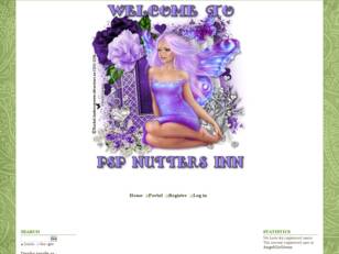
PSP NUTTERS INN
A friendly group of Taggers and Siggy Piggies. Drama free and something for everyone. All are welcome at PNI

Artistic Tag Passions
A drama free place to make friends, exchange tags, and just have fun. Come in and make yourself at home.
Dinar Revaluation Forum
This forum gives news and insights about the Iraqi Dinar, Vietnam Dong, Forex currencies and investments, Iraq, CBI


NJ Strong Weather Forum
A place for Meteorologist, enthusiast/hobbyist to come together and discuss various weather events, including pattern changes, storm threats, and observations.
The Mugen Multiverse
A place for Mugen development, discussion, and releases, we welcome any and all character development including anime, comics and video game characters.
The Dolfan Cave
Free forum : A place for Miami Dolphins fans to talk all things Dolphins, NFL and college football, and anything else.
LOVE AND PROTECT ALL CHILDREN
A discussion of children, their welfare, well being and lives. We must protect them, they are our future.
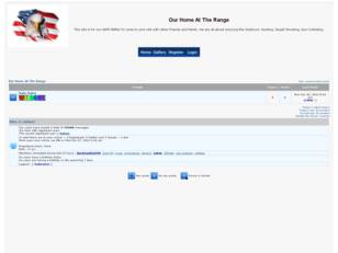
Home at the Range
This site is for our HATR FAMILY to come to and visit with other Friends and Family. We are all about enjoying the outdoors. Hunting Target Shooting, Gun Collecting
NFL Fans Serbia
Sve o američkom fudbalu na jednom mestu, forum koji okuplja fanove NFL-a kako iz Srbije, tako i iz susednih država sa Balkana - NFL Fans Srbija.
