The forum artarena.forumotion.com doesn't exist
Verify the internet address you typed : artarena.forumotion.com,
and try again if there is a mistake.
It is possible that the administrator has chosen to delete it.
Search results for : artarena.forumotion.com

A PSP PLACE
A PSP PLACE : PSP, Taggin fun, win tags, work tutorials much more. We have FTU tubes also.

Artistic Tag Passions
A drama free place to make friends, exchange tags, and just have fun. Come in and make yourself at home.

Zodlikeproductions
Conspiracy and news forum aimed to expose globalist/NWO agenda. Informations from alternative and local sources about conflicts and terrorism.
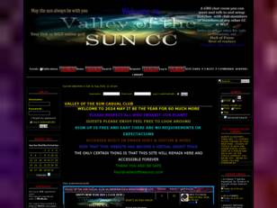
Valley of the Sun Casual Club
Valley of the Sun Casual Club: Entertainment , information , online golf, sports, current events, tutorials, country clubs, golf tips, gifs, videos, fails, girls, cars, animals

Voip Traffic
Voip Traffic, Voip News, Voip Exquipment, Voip Fraudlist, Voip Vendor, Voip Provider, Dialer, Call Center

Kindred Spirits
Kindred Spirits: a forum for the discussion of relationships between adult family members.

Plymouth Argyle Talk - Democratic
A democratic Plymouth Argyle forum where fans can discuss the Pilgrim's Progress. ATD is the ONLY 100% truly independent Argyle fans forum.
